Script-based widget examples ↗
Create script based widgets based on scripts for reports and dashboards in Cortex XSIAM.
You can use script-based widgets to perform calculations on and visualize third-party data.
Note
Add the widget tag in the script settings to make the script available for use in script-based widgets. For more information, see Create a script.
The following are sample Python scripts for the graph types Single Value, Pie, Line, and Column.
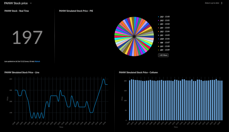
The following example script creates random, mock data to simulate a stock price fluctuating over a short period of time. Use this example to build your own script that brings in third-party data and display trends using a pie, line, or column chart.
import random
import json
from datetime import datetime, timedelta

def main():
    chart_data = []
    start_time = datetime.strptime("13:00", "%H:%M")

    # Start the price at a realistic value
    current_price = 202.0

    # Simulate 50 data points
    for i in range(50):
        # Generate a time label in 1-minute jumps
        time_label = (start_time + timedelta(minutes=i)).strftime("%H:%M")

        # Create the data point for the chart
        data_point = {
            "name": time_label,
            "data": [int(current_price)],
            "groups": []
        }
        chart_data.append(data_point)

        # Simulate the next price by adding a small change to the current price
        price_change = random.uniform(-1.5, 1.5) # A small drift up or down
        current_price += price_change

    # Return the data formatted exactly as in your working script
    return_results({
        "Type": 1,
        "ContentsFormat": "json",
        "Contents": json.dumps(chart_data)
    })


if __name__ in ('__main__', '__builtin__', 'builtins'):
    main()
When used in a widget:
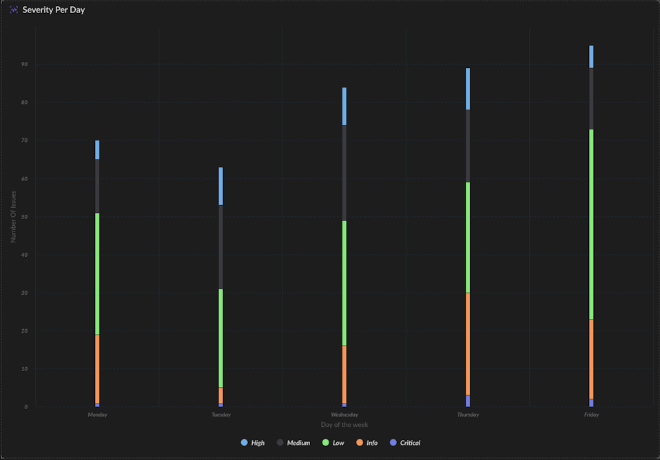
The following example script generates simulated data representing the count of security incidents (or other events) broken down by severity level for each day of the week (Monday to Friday). Use this example to build your own script to create a stacked column chart. Configure the widget with graph type Column subtype Stacked.
import json
import random

def main():
    chart_data = []
    days = ["Monday", "Tuesday", "Wednesday", "Thursday", "Friday"]
    severities = ["Critical", "High", "Medium", "Low", "Info"]

    for day in days:
        groups_list = []
        daily_total = 0

        for severity in severities:
            count = 0
            if severity == "Critical":
                count = random.randint(0, 5)
            elif severity == "High":
                count = random.randint(5, 15)
            elif severity == "Medium":
                count = random.randint(10, 25)
            elif severity == "Low":
                count = random.randint(20, 50)
            else:
                count = random.randint(5, 30)

            daily_total += count
            groups_list.append({"name": severity, "data": [count]})

        chart_data.append({
            "name": day,
            "data": [daily_total],
            "groups": groups_list
        })

    return_results({
        "Type": 1,
        "ContentsFormat": "json",
        "Contents": json.dumps(chart_data)
    })
When used in a widget: